Showing posts with label data. Show all posts

16 October 2024

Open Data for Education

There’s a global crisis in learning, and we need to learn more about how to address it. Whilst data collection is costly, developing countries have millions of dollars worth of data about learning just sitting around unused on paper and spreadsheets in government offices. It’s time for an Open Data Revolution for Education.

The 2018 World Development Report makes clear the scale of the global learning crisis. Fewer than 1 in 5 primary school students in low income countries can pass a minimum proficiency threshold. The report concludes by listing 3 ideas on what external actors can do about it;
  1. Support the creation of objective, politically salient information
  2. Encourage flexibility and support reform coalitions
  3. Link financing more closely to results that lead to learning
The first of these, generating new information about learning, can be expensive. Travelling up and down countries to sit and test kids for a survey can cost a lot of money. The average RCT costs in the range of $0.5m. Statistician Morten Jerven added up the costs of establishing the basic census and national surveys necessary to measure the SDGs — coming to a total of $27 billion per year, far more than is currently spent on statistics.

And as expensive as they can be, surveys have limited value to policymakers as they focus on a limited sample and can only provide data about trends and averages, not individual schools. As my colleague Justin Sandefur has written; “International comparability be damned. Governments need disaggregated, high frequency data linked to sub-national units of administrative accountability.”

Even for research, much of the cutting edge education literature in advanced countries makes use of administrative not survey data. Professor Tom Kane (Harvard) has argued persuasively that education researchers in the US should abandon expensive and slow data collection for RCTs, and instead focus on using existing administrative testing and data infrastructure, linked to data on school inputs, for quasi-experimental analyses than can be done quickly and cheaply.

Can this work in developing countries?
My first PhD chapter (published in the Journal of African Economies) uses administrative test score data from Uganda, made available by the Uganda National Exams Board at no cost, saving data collection that would have cost hundreds of thousands of pounds and probably been prohibitively expensive. We’ve also analysed the same data to estimate the quality of all schools across the country, so policymakers can look up the effectiveness of any school they like, not just the handful that might have been in a survey (announced last week in the Daily Monitor).

Another paper I’m working on is looking at the Public School Support Programme (PSSP) in Punjab province, Pakistan. The staged roll-out of the program provides a neat quasi-experimental design that lasted only for the 2016-17 school year (the control group have since been treated). It would be impossible to go in now and collect retrospective test score data on how students would have performed at the end of the last school year. Fortunately, Punjab has a great administrative data infrastructure (though not quite as open as the website makes out), and I’m able to look at trends in enrolment and test scores over several years, and how these trends change with treatment by the program. And all at next to no cost.

For sure there are problems associated with using administrative data rather than independently collected data. As Justin Sandefur and Amanda Glassman point out in their paper, official data doesn’t always line up with independently collected survey data, likely because officials may have a strong incentive to report that everything is going well. Further, researchers don’t have the same level of control or even understanding about what questions are asked, and how data is generated. Our colleagues at Peas have tried to useofficial test data in Uganda but found the granularity of the test is not sufficient for their needs. In India there is not one but several test boards, who end up competing with each other and driving grade inflation. But not all administrative data is that bad. To the extent that there is measurement error, this only matters for research if it is systematically associated with specific students or schools. If the low quality and poor psychometric properties of an official test are just noisy estimates of true learning, this isn’t such a huge problem.

Why isn’t there more research done using official test score data? Data quality is one issue, but another big part is the limited accessibility of data. Education writer Matt Barnum wrote recently about “data wars” between researchers fighting to get access to public data in Louisiana and Arizona. When data is made easily available it gets used; a google scholar search for the UK “National Pupil Database” finds 2,040 studies.

How do we get more Open Data for Education?
Open data is not a new concept. There is an Open Data Charter defining what open means (Open by default, timely and comprehensive, accessible and usable, comparable and interoperable). The Web Foundation ranks countries on how open their data is across a range of domains in their Open Data Barometer, and there is also an Open Data Index and an Open Data Inventory.

Developing countries are increasingly signing up to transparency initiatives such as the Open Government Partnership, attending the Africa Open Data conference, or signing up to the African data consensus.

But whilst the high-level political backing is often there, the technical requirements for putting together a National Pupil Database are not trivial, and there are costs associated with cleaning and labelling data, hosting data, and regulating access to ensure privacy is preserved.

There is a gap here for a set of standards to be established in how governments should organise their existing test score data, and a gap for financing to help establish systems. A good example of what could be useful for education is the Agriculture Open Data Package: a collaboratively developed “roadmap for governments to publish data as open data to empowering farmers, optimising agricultural practice, stimulating rural finance, facilitating the agri value chain, enforcing policies, and promoting government transparency and efficiency.” The roadmap outlines what data governments should make available, how to think about organising the infrastructure of data collection and publication, and further practical considerations for implementing open data.

Information wants to be free. It’s time to make it happen.
05 March 2025

Rising DFID Spending hasn't Crowded Out Private Giving

Last week I was poking around the ESRC’s 'Administrative Data Research Network’ and discovered the Charity Commission data download website - containing every annual financial return made by every individual charity in England and Wales since 2007. The data comes in a slightly weird file format that I’d never heard of, but thankfully the NCVO have a very helpful guide and Python code for converting the data into .csv format (which was easy enough to use that I managed to figure out how to run without ever having really used Python). 

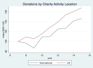
One obvious question you could ask with this data is whether the private income of international charities has dropped as DFID spending has gone up (more than doubled over the same period) - it is conceivable that people might decide that they could give less to international charity as more of their tax money is being distributed by DFID.

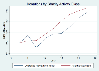
That does not seem to be the case at all. There are two ways of identifying international charities - by their stated area of operation, or by their stated objective category. I’ve coded charities that have no UK activities as “International”, and also picked out the charities that ticked the box for "Overseas Aid/Famine Relief” as their activity category. These two categories do overlap but far from perfectly. 

Charities have multiple categories of income - I focus here on the ‘voluntary’ category which basically means all donations, whether large or small. 

Charities with exclusively international activities, and those focused on 'overseas aid' did appear to take more of a hit than domestic charities from the 2008 global financial crisis and recession, but since then growth has tracked the income of other charities (and is 40-50% higher in 2015 than in 2007 (not adjusting for inflation)). 


You can download the Stata code here, csv files (large) here, and variable descriptions here.

09 October 2024

We have no idea what countries are spending on education

Listen to some international education people and you get the impression that the education problem is mostly solved if we could just spend more money. The story goes something like “Poor countries spend X on education, if they could 1.5X then all the kids could get a good education, they can’t afford 1.5X, so we should fill the gap with aid."

The reality is, even if it was the case that just filling the gap would solve the problem (which is dubious to say the least) , we don’t really even know what the gap is.

This is Silvia Montoya, Director of the UNESCO Institute for Statistics:
"governments need detailed and disaggregated data to ensure that their resources are allocated equitably and effectively within their education systems. At the same time, donors need the data to better evaluate whether the aid they provide is an incentive for governments to increase spending commitments or if they are crowding-out domestic resources.

For the moment, the availability and completeness of education finance data is unfit for these purposes, with less than one-half of countries able to regularly report key information, such as total government expenditure on education” (my emphasis)
Nevermind the purpose of accountability and transparency to the citizens of developing countries...

Good luck to the new Commission on Financing Global Education!

20 August 2025

How many kids attended school in South Sudan today?

You'll soon be able to find out online from live SMS reports, currently being piloted in Lainya County near Juba (1,319 girls and 1,507 boys reported present so far today in case you were wondering, 84 girls absent and 136 boys absent), with plans to roll out to the whole country. Data is reported by state, county, and even by school. As CG says, "South Sudan may not be at the top on most things, but on SMS real time school attendance monitoring, we think we may actually be leading the world." Ana Fii Inni (I am here!) is a South Sudan Ministry of Education project being supported by the DFID Girl's Education Programme.

Unrelated, I'm also told that it is possible to procure schools through the church in South Sudan for half of the $30,400 figure reported here.

24 July 2025

How to make maps

It's not new, but thought I'd share this handy tool "StatPlanet" for mapping country-level and sub-national state-level data. It took me half an hour to download and figure out, and then all you have to do is import your Excel spreadsheet in the right format, and it spits out pretty maps. The list of countries with sub-national maps built-in is here. The interactive flash maps are pretty cool too. 

Nigeria: Primary School Net Attendance Ratio (%)
Source: Nigeria Education Data Survey 2010

21 May 2025

Seeing like a State vs Seeing like a Donor

In which Justin Sandefur takes Chris Blattman and Bill Gates to school.... he argues that African governments don't need GDP data or internationally comparable micro survey data, they need good quality administrative data.
This, rather than the need for more duplicative household surveys, is the big challenge facing African statistics. Right now governments face a trade-off between high quality survey data of limited relevance, and low quality administrative data that actually fits their needs. It doesn’t have to be this way. But to overcome the trade-offs donors are going to have to back off with their pet survey projects, and stats bureaus across Africa will need to exert some renewed independence, and stop serving as research consultancies for donors.
Zing!

03 April 2025

Bad Graphics

This is a guest post by Sean Fox at the LSE

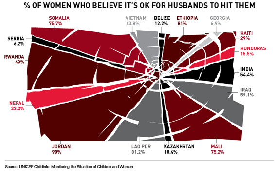
This infographic, which came to my attention a few weeks ago on International Women’s day, has been on my mind because it is one of the WORST visual presentations of data I have seen in years: 


So what? Well, it contains information on an interesting and important topic (attitudes about domestic abuse) in a UN report. It should inform. Instead it confuses and distorts the facts. It violates almost every rule outlined in the bible of infographics, The Visual Display of Quantitative Information by Edward R. Tufte. Let me just name a few.
  1. It looks like a quasi-pie chart. As such it implicitly suggests to the viewer that the slices represent portions of a whole. They do no such thing. They represent survey responses from a relatively small and arbitrary selection of countries around the world. 
  2. The sizes of the ‘slices’ do not correspond to the numbers they purportedly represent. Just compare the Rwanda slice to the Vietnam slice. Huh?? 
  3. It uses multiple colours. This is a great way to pack more data into a small space, but in this case the colours actually contain no information at all. They’re just randomly assigned. More visual confusion.
  4. It uses a lot of ink to represent a small amount of data. Rule number 1 of good info graphics is to maximise the data/ink ratio. Less is more. 
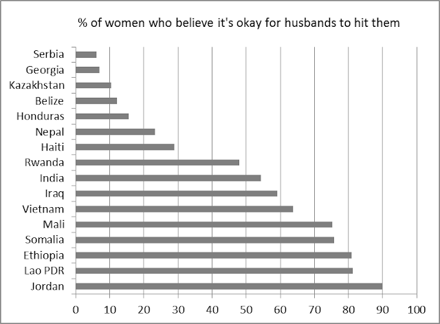
So, how should it have been presented? There are many better ways, but a very simple one, which took me about 5 minutes in Excel is this:


While the first figure confuses the brain and obscures the significance of the data, this simplified version immediately throws up all kinds of interesting questions. Why do the women of the post-Soviet nations of Serbia, Georgia and Kazakhstan seem to have some of the lowest tolerance for domestic abuse in the world? How is it that the women of Jordan, which has a relatively liberal and modernising king and a female role model in the politically active and globetrotting Queen Rania, seem to largely accept domestic violence? What accounts for the wide gap in attitudes between women in the East African nations in Ethiopia and Rwanda? Is it due to “culture” or government policy and discourse?

These are interesting and important questions that are revealed by a simple improvement in the presentation of the data.

Come on, UNICEF. You can do better.

14 February 2025

Love in Rwanda

Rwanda is one of the most loving countries in the world.

Sadly, I am telling you this not from personal experience (anecdotal data is rubbish anyway) but real hard survey evidence.
In 2006 and 2007, Gallup went to 136 countries and asked people, “Did you experience love for a lot of the day yesterday?” It’s the largest such dataset ever collected.
90% of Rwandans felt love, compared to the global average of 70%, and higher than the US (81%), UK (75%), and poor lonely Japan (only 59%).

Happy Valentine's Day

24 October 2024

Surveys, lions, and suicide bombers

The opening paragraph of the OPM survey manual is fucking cool:
OPM has an ability to carry out surveys in amazing places, ranging from the deserts of Northern Kenya via the mountains of Pakistan to the tiny islands of the Maldives. People deal with the usual challenges of sand, snow, sea sickness, and occasionally with hazards such as lions or suicide bombers.

01 November 2024

Inflation in South Sudan

YIKES! 


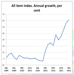
SIXTY PERCENT inflation in South Sudan. That is pretty much crisis levels. Credit to the National Bureau of Statistics for getting the figures out so quickly. This is largely a reflection of how dependent South Sudan is on imports, as poor rains regionally have sent food prices soaring in Kenya and Uganda, and independence has caused disruption to Northern traders and at the border.

11 May 2025

New Sudan Bombing Data

Sudan researcher Eric Reeves has painstakingly compiled a downloadable spreadsheet of 1,414 referenced bombing incidents by the Khartoum government in Sudan since 1993. From the report:
This report grows out of my belief that the almost complete anonymity and invisibility of Sudanese civilian victims of targeted aerial military assaults is morally intolerable. So, too, are such attacks on humanitarian aid workers and operations, including hospitals and feeding centers.  There have been many casualties among relief personnel. For more than twelve years, these assaults have been standard counter-insurgency strategy on the part of the National Islamic Front/National Congress Party regime in Khartoum.  As I argue and as the facts demonstrate, such a strategy—obscenely destructive in its consequences—has no historical precedent anywhere in the world. It would be presumptuous to dedicate such a document to so many thousands of victims; it must stand simply in memoriam. ER - May 2011
via John Ashworth

14 April 2025

More Than Good Intentions

More Than Good Intentions: How a New Economics is Helping to Solve Global Poverty is the new book by Dean Karlan and Jacob Appel, released today. 

I'm about 95% certain that I would be able to tell you I love the book even if I wasn't being paid to promote it. It's like Freakonomics only about global development.

If everyone would just read this book then I would probably be out of a job because you would all be totally convinced of the need for smart evidence-based aid and know all about the fantastic research that IPA is involved with. And I still want you to read it.

So go on, make me unemployed, I dare you.

You can read Chapter 1 here.

31 March 2025

India is really really big

I just got this email from the Skeptical Bandit (republished with permission). Just to clarify - this is not my alter ego but a real person with poor taste in pseudonyms.
India released its prelim Census estimates today. Lots of blog worthy nuggets -
India's population is about the size of the US, Brazil, Pakistan, Bangladesh, Indonesia and Japan put together. 
Its more than the whole of Africa and just UP (my beloved home state) has a greater population than any developing country but China or Indonesia- so much for all the people who say India is over-studied in development or over-invested in aid!!! 
The cost of doing a Census is about 40 cents per person. This is somewhere between one-thirtieth and one-fiftieth of the cost in South Sudan. Not saying that the differences in cost of service delivery are always the same magnitude, but guess why it REALLY makes sense to be looking at India. 
Lots of changes in demographics - an improving sex ratio, decreasing growth (esp in the most populous states) and a pretty significant jump in literacy with greater gains for women.
I've attached their PDF presentation here. Take a look. very nifty!


A note on this map - non-Indians should read the numbers with care - the commas are in unusual places due to Crores or Lakhs or some weird thing like that.

New data on States in Southern Sudan

The SSCCSE has uploaded the latest version of the Key Indicators document on its website. 
Key Indicators are now also available for each of the individual states. 
The link is http://ssccse.org/key-indicators-for-southern-su/
We hope you find these documents useful and please let us know if there are any comments or feedback.

17 March 2025

News from Juba

1. The Assembly has passed the 2011 Budget. (Hopefully it'll be up on the GoSS website shortly)

2. The SSCCSE has published its 2010 Statistical Yearbook. (Take note folks writing about Southern Sudan...)

3. The New South Sudan Pound will have Garang's face on it. (Commiserations to the guy who wrote that report on post-secession currency options illustrated with a hypothetical South Sudan dollar)

09 March 2025

The future of data collection

image
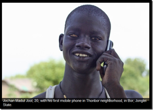
The Sudanese like to talk, so giving out mobile phones is always going to be a winner. Gabriel Demombynes at the World Bank is now starting to get the first data in from the Southern Sudan Experimental Phone Survey which I wrote about last year.
In November, in conjunction with the Southern Sudan Centre for Census, Statistics and Evaluation, we delivered mobile phones to 1000 households in the 10 state capitals of Southern Sudan. Each month starting last December, Sudanese interviewers from a call center in Nairobi have phoned respondents on those phones to collect information on their economic situation, security, outlook, and other topics.
What is so exciting about this project is the sheer quantity and frequency of data that is being collected at relatively low cost.

For more info see Gabriel’s blogpost and photo essay, and make sure to follow his new Twitter account@gdemom.

07 February 2025

Brain Gain


The hypothesis goes something like this: first imagine you are born in a poor African country where the financial returns to education are low. Getting yourself qualified isn’t going to magic up any new jobs.

Now imagine there is a chance you might be able to escape to a rich country, where education does matter and has a big impact upon earnings.

The amount you choose to invest in your education depends on your chances of emigrating in the future.
So that’s at the individual level - but here’s the thing; at the national level the promise of emigration might actually increase the stock of educated people rather than reduce it if everyone decides to try and get more education than they would otherwise. 

That’s the hypothesis.

Now for some evidence:
This paper explores a unique household survey purposely designed and conducted to answer this research question. We analyze the case of Cape Verde, a country with allegedly the highest ‘brain drain’ in Africa, despite a marked record of income and human capital growth in recent decades. Our micro data enables us to propose the first explicit test of ‘brain gain’ arguments according to which the prospects of own future migration can positively impact educational attainment. According to our results, a 10pp increase in the probability of own future migration improves the average probability of completing intermediate secondary schooling by 8pp. Our findings are robust to the choice of instruments and econometric model. Overall, we find that there may be substantial human capital gains from lowering migration barriers.
Catia Batista, Aitor Lacuesta, and Pedro C. Vicente, Forthcoming in the Journal of Development Economics, ungated version here

02 December 2024

The Economist still using made-up poverty stats


That 90% living on less than $1 a day stat? Pulled completely out of thin air about 5 years ago because there was no data. Literally just made up on the spot.
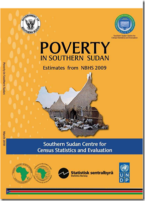
Now there is some data, thanks to the hard work of the staff at the Southern Sudan Centre for Census, Statistics and Evaluation, and some generous funding and technical assistance from various donors. And it is even ONLINE. image
I used to think that statistics in poor countries were underfunded, but if we’re all going to ignore them anyway and just make stuff up….

UPDATE: Oh yeah, and I forgot to mention, this one fully conforms to Easterly's "First Law of Development Stats: Whatever our Bizarre Methodology, We make Africa look Worse".

The actual real stats (not yet adjusted for PPP) would put the proportion of the population living on less than $1 a day at more like 50%.

28 November 2024

R-E-S-P-E-C-T

Across the vast majority of countries, Africans perceive respect to be asymmetric. In other words, they believe they respect Americans and the Chinese but they don’t believe these two groups of foreigners respect them.

That’s from Gallup survey data. It’s such a shame all of Gallup’s fascinating data is private. Perhaps this is an area for more international public funding.

When Gallup asked Africans about the presence of foreigners in their respective countries, an average of 44 percent said there are “too many” Chinese and 16 percent said there are “too many” Americans. These figures hardly tell the whole story. Strong majorities in many of China’s trading partners perceive the Chinese presence to be overwhelming. For example, 93 percent of Botswanans, 89 percent of Angolans, 69 percent of South Africans and 68 percent of Zambians say there are “too many” Chinese in their countries.

Africans’ perceptions that Americans are too numerous are far less widespread. It’s highest in Djibouti as 51 percent of residents said there are “too many” Americans in their country and lowest in Benin (7 percent) and Zimbabwe (3 percent). However, relatively significant proportions of Angolans (37 percent), Sierra Leonans (30 percent) and Liberians (29 percent), among others, told Gallup there are “too many” Americans in their countries.