Afrobarometer asked over 33,000 Africans between 2010 and 2012 what the most important problem facing their country that government should address is. Here are their answers. With apologies for the tiny font, but it's worth reading down the full list (I left off a few of the country-specific responses at the bottom).
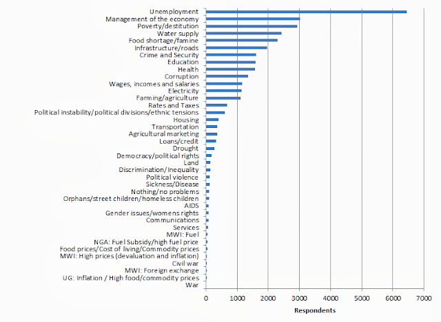 Data from: Benin 2012, Botswana 2012, Burkina Faso 2012, Burundi 2012, Cape Verde 2011, Ghana 2012, Kenya 2011, Lesotho 2012, Liberia 2012, Malawi 2012, Mali 2012, Mauritius 2012, Namibia 2012, Nigeria 2012, Sierra Leone 2012, South-Africa 2011, Tanzania 2012, Togo 2012, Uganda 2012, Zimbabwe 2012 (Base=33598; Weighted results)
I'm quite surprised by how high up water supply is, but less surprised by the top 3 of unemployment, the economy, and poverty. The public policy challenge is still, first and foremost, about broad-based inclusive economic growth. Interesting to compare this with Justin Sandefur's analysis of what African researchers care about (jobs).
The tragedy is that we don't really have a clue what policy instruments can create jobs. For most of sub-Saharan Africa the challenge is a lack of demand for labour. What is needed is a way of linking African workers with consumers who have money - who are mostly in rich countries. This link could come in 3 ways:
1: Trade. Africans stay where they are and export things to rich countries. This one looks difficult in most countries, which are uncompetitive with poor Asian countries in manufacturing, and don't yet have the skills or infrastructure for high-tech service exports. Gains to agricultural productivity holds some promise, but faces serious barriers to getting going.
2: Migration. The Africans come to rich countries. An economic no-brainer, and a political non-starter.
3: Tourism. The rich people go to Africa. Tourism? Really?
There will probably be marginal improvements in all 3 areas, but its hard to see where the really big shift that could get millions of Africans up to rich country poverty lines of around $12.50 per day over the next generation is going to come from.
The very easy to use online Afrobarometer data analysis tool is here.
[and before anyone says it, of course Africa is not a country, but actually the patterns look pretty similar when you look at the country-level data, I just couldn't figure out a good way of showing that data visually - very open to suggestion]

 From the